LOGOS & IDENTITY
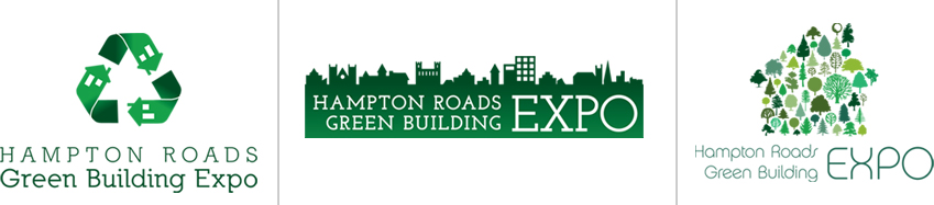
HAMPTON ROADS GREEN BUILDING COUNCIL (HRGBC)
The HRGBC is an amazing organization in southeastern Virginia that helps advocate for better building practices and materials to help keep our environment healthier and more efficient. They requested a logo among other items for a Green Building Expo that they hosted, and these are samples of the original ideas I gave them to choose from. Their favorite and initial direction ended up being the second logo.
back to top
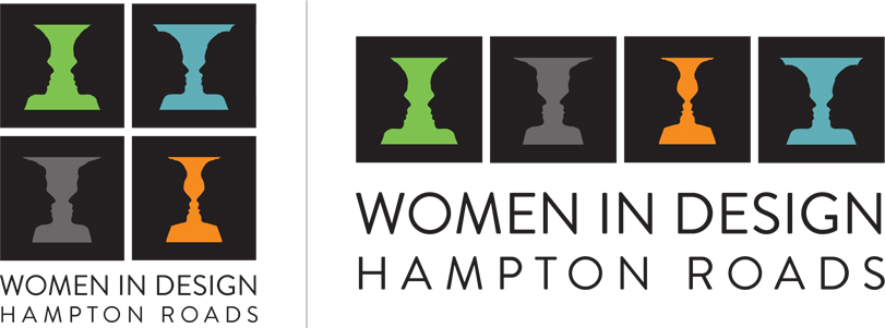
WOMEN IN DESIGN HAMPTON ROADS (WIDHR)
I enjoyed helping create the logo and idenity for Women in Design Hampton Roads, which is a committee of the American Institute of Architects Hampton Roads Chapter. What I strived to attain in the final variations was a stylish logo that shows elegance, without being overly flowerly or soft, much like the women in the group itself.
back to top
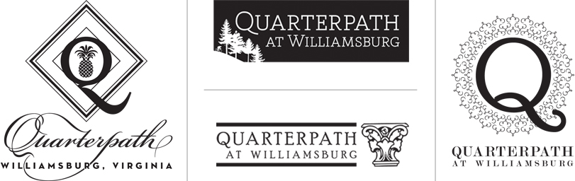
QUARTERPATH AT WILLIAMSBURG
Interlaced into one of the oldest communities in the country, Quarterpath at Williamsburg is a proposed residential, office, and commercial development just outside of Colonial Williamsburg. The following identities were proposed to the client to reflect the area's historic and tightly knit community.
back to top
MISCELLANEOUS LOGO DEVELOPMENT
The following logos were created for a variety of clients, some in conjunction with Creative Art & Design Studios, and the ones shown below were the final chosen directions after several proposed options were presented to each.

back to top
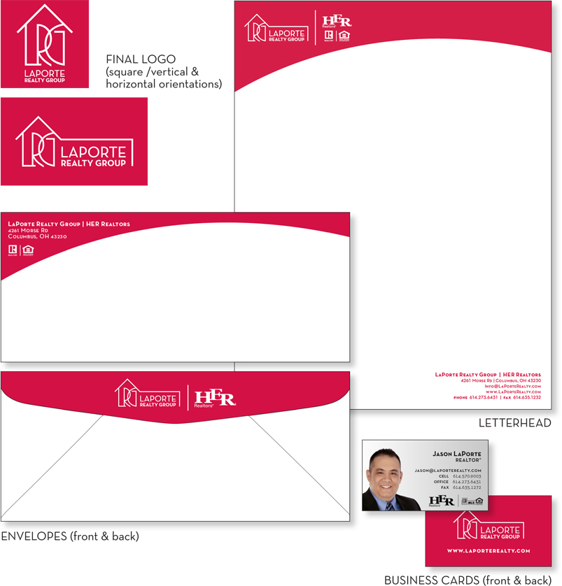
LAPORTE REALTY GROUP
A long-time friend recently began his own realty group, and was in need of an eye-catching logo and branding materials to stand out from other Central Ohio realtors. The following logo and pieces were his final selections.
back to top
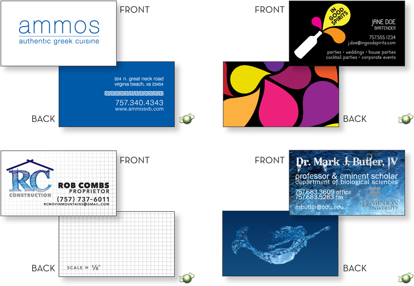
BUSINESS CARD DESIGNS
Although one of the smallest and least expensive print pieces one can use to promote themselves or their brand, business cards can provide plenty of impact for current and future clients and customers. The following cards, all designed for clients of Creative Art & Design Studios, make use of both sides of the business card for even more visual interest. For RC Construction, the cards double as grid paper for sketches, and for Dr. Butler's card, the back features a mermaid, the symbol for the City of Norfolk, comprised of various sea creatures to emphasize his involvement in marine biology.
back to top
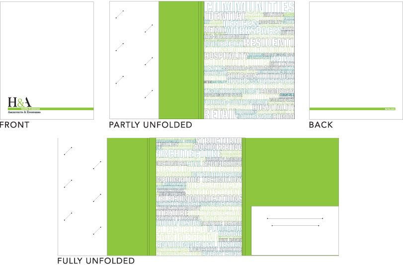
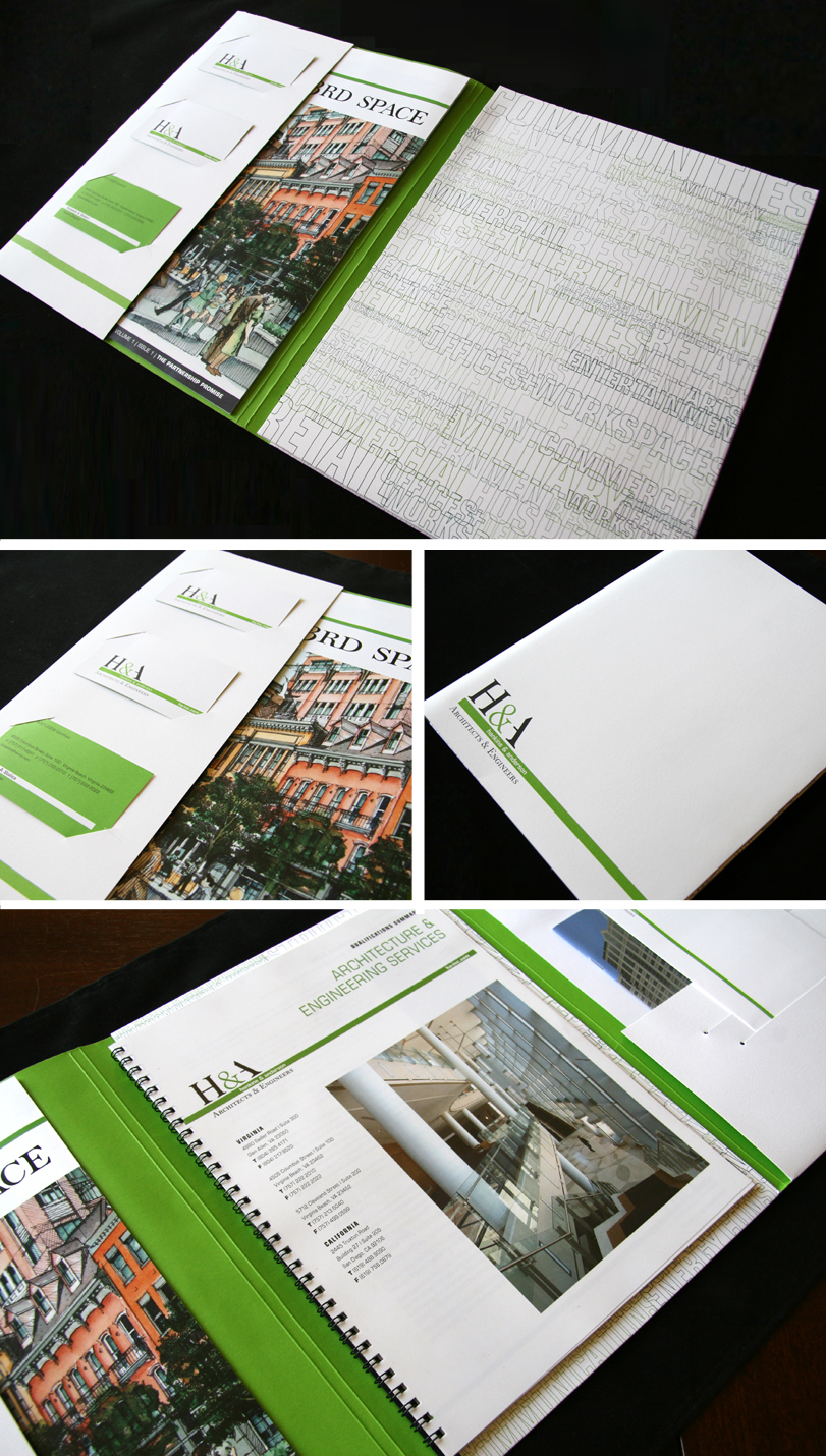
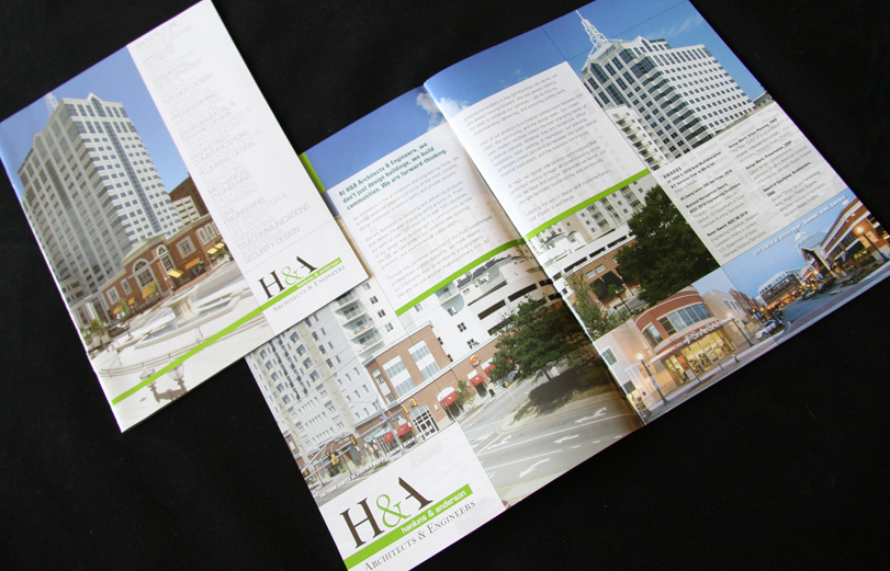
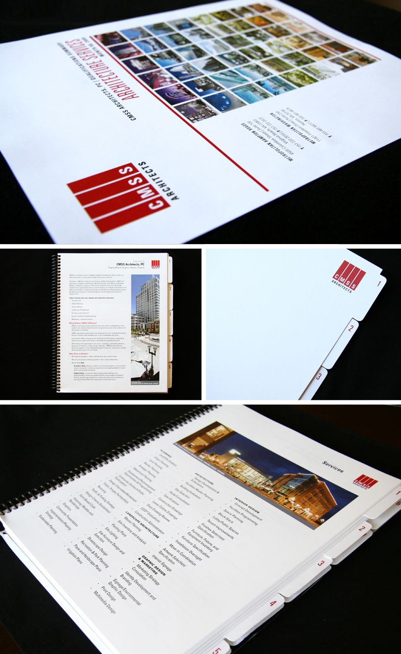
CMSS ARCHITECTS / H&A ARCHITECTS & ENGINEERS
As part of the in-house marketing team at an architecture-turned-A&E firm, I was tasked to provide updated marketing materials that appropriately showcased a refreshed brand image. Given an initial logo and color scheme to work with, I created the following pieces and design templates which now allowed the firm's projects to stand out, rather than the previously dated marketing collateral.
cmss architects business development materials
back to top
H&A ARCHITECTS & ENGINEERS COLLATERAL